← BACK

ACD Hospital

A mobile app that digitizes physical services provided by ACD Hospital.

The context

The design of the app was created as a result of the UX Mentoring Program in Vietnam (https://www.uxmp.vn/).

The team

Mentor: Shriya Shekhar

  • Create the project timeline
  • Give feedbacks on each stage of the design

Mentee: Steven Doan (Me)

  • Conduct competitor analysis and user research
  • Draw wireframes
  • Run user testings
  • Write case study

Mentee: May Nguyen Huynh

  • Conduct user research
  • Draw wireframes
  • Run user testings
  • Create high fidelity prototypes

Timeline

12 weeks from Aug 10 to Oct 18, 2020. We spent a few hours each week on this project.

PROBLEM

How might we improve the patients' experiences and reduce their unnecessary waiting time at hospitals in Vietnam?

IDEATION PROCESS

  • Draw an AS-IS and TO-BE diagram
  • Create a patient journey
  • Brainstorm improvements
  • Select an approach to solving the patients' problems

SOLUTION

A "hospital in your pocket" app - a mobile app that digitizes the majority of physical services at a hospital.

Research

We started this project by gaining understandings with the users.

Step 1: Quantitative research

We surveyed patients in different ages in Vietnam, and we learned that 82.6% of them agreed that over-crowding and waiting time are the main concerns when going to a hospital.

One of the survey results

Step 2: Qualitative research

We interviewed 8 people in Vietnam to understand the pain points behind over-crowding and long waiting time.

We figured out that:

  1. Over-crowding happens because patients in small provinces want to visit hospitals in big cities.
  2. Long waiting time occurs due to the downtime between steps in the treatment process.

We discovered that the limit of the healthcare system in Vietnam leads to the unsatisfied patients' experiences.
To solve this system problem, we'll need a radical innovation.

Step 3: Competitor analysis

To gain perspectives in the feasibility, we examined the current digital healthcare solutions in the Nordics and Vietnam.

Below is our comparison of the features in some popular healthcare apps.

Some of the feature comparison
We saw that the idea of a super app is feasible with features supporting online booking and time-tracking.

Define persona

With the information we collected, we formed our primary user persona.

Primary user persona

In general, our target users are those:

  • Can use smartphones comfortably because smartphones are the medium to deliver our values to users.
  • Are in the middle-income class or below because rich people can pay a lot of money to get premium services.
  • Are busy with work so time is important to them.

Our ideation process

Based on the knowledge from the research and persona, we started to ideating the solutions.

Step 1: Draw an AS-IS and TO-BE diagram

AS-IS Diagram shows current patient journey
TO-BE Diagram shows proposed future patient journey

View these diagram details at: https://miro.com/app/board/o9J_kmvoMXI=/

This step helped us to identify four areas where the waiting time can be optimized.

These areas of improvements are:

  • When patients reserve the appointment with doctors physically at a hospital
  • When patients go around a hospital to do lab tests
  • When patients come back to meet doctors after finishing the lab tests
  • When patients buy the medicines inside a hospital.

Step 2: Create a customer journey

We divided the journey into four phases, each include one area of improvements above.

Customer journey

Step 3: Brainstorming improvements

Under each phase, we gave ideas on how we could make the patient experiences better. At this stage, our team ideas tend to be similar to the current solutions in the market.

Step 4: Select the approach to solving the problem

To select what features we should have in our app, we started by coming up with strategic approaches to the solution.

Two proposed approaches
In the end, we selected approach one - A mobile app which is fully customized for a specific hospital.

Why we that approach:

  1. We realized that "Airbnb for patients" only solve a small part in a big puzzle. With the insights from our research, we need a radical innovation.
  2. We assumed that the digital transformation the hospital need to have to implement our solution is doable.
  3. To solve the problem, we decided to approach the solution from a holistic view. Instead of improving patients' experience in specific moments when they are at hospitals, we examined the whole patient's journey from coming to leaving the hospital.

Low-fidelity wireframes

We began to draw our first draft of the solution on Figma.

App Features & Values To Users

After user research and ideation, we mapped out key features that can help patients enhance their experiences and reduce unnecessary waiting time at the ACD hospital in Vietnam.

App features and values to users

Wireframes

Wireframes

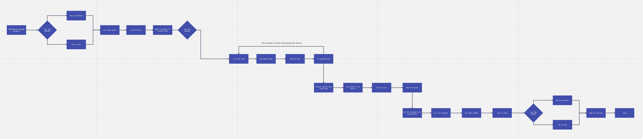
After booking, patients will go through the treatment process in one section "appointment" as illustrated below. In our view, this sitemap approach can make the patient journey comprehensive.

Sitemap to explain our user flow after booking

User testing on low-fidelity wireframes

We tested the wireframes with 8 users to understand how easy to use the app, and we got some feedbacks below:

  • Most of users wonder why they have to pay upfront when booking. Can they pay after they meet the doctor? Can they pay by cash?
  • The user may have no idea which doctor to choose when they book an appointment.
  • There're too many things on the Homepage, while News + Search are not necessary. News should be changed to Information.
  • The "Done check up/the test" buttons are not necessary because they create more work for the users. The process after scanning bar code should be automated.
We used these feedback to improve our high-fidelity prototype.

High-fidelity prototype

We made the final design of our solution and did another user testing.

Designs of phase 1 in the user journey

Patients book an appointment with doctors.

Designs in phase 1 of the user journey

Designs of phase 2, 3, and 4 in the user journey

Patients take lab tests, Patients receive the diagnosis from doctors, and Patients buy medicine.

Designs in phase 2, 3, and 4 of the user journey

Feedback of users after high-fidelity user testing

In general, all users we tested gave a lot of positive feedback to the app. Still, there are areas that we can improve. For example:

  • There should be more explanations on the app so that first-time users can won't get confused.
  • Primary call-to-action on the homepage should be more emphasized.
  • Users can see details of lab tests before making payment.
  • There should be an indicator that users can leave the app and still can go back to the current phase of the treatment process.

Success Metrics

We tested 8 users who we interviewed in the Research phase, with our high-fidelity prototype to measure whether we succeed in solving the users' problems.

Here are the results:

  • 8/8 users believed the app could help them utilize the waiting time more effectively.
  • 6/8 users believed the app could reduce their waiting time at a hospital, but most of them are skeptical whether the waiting time will be reduced significantly.
  • 6/8 users felt that they would be interested in using this app if this app goes live with the current features.
  • 2/8 users who are skeptical about our solution are those above the middle-aged.
We realized that our persona will be the early adopter of the solution and this concept does solve the patients' problems!
← Back to all projects